Let’s pick the colors that Aux will be using across its projects and art assets.
Should we stick to axolotl colors? ![]()
i can’t recommend using Coolors enough here, it’s super easy to use and it makes great schemes.
Could be a good idea, though I wonder if we should do something similar to catppuccin, having themes with each theme having ~14 colors along with grayscale colors for text and bg’s.
speaking from experience, 14 colors is a lot and it often leads to inconsistent usage. nine colors is kind of the practical maximum, but six or seven colors is the ideal.
Not a design person and really just throwing it out there, Au is the element abbreviation for gold. Putting some yellow tones in there might be nice (and your average aux jack will often be gold anyway, so i think it does make thematic sense)
I think a color scheme something like this one would be thematically appropriate, it’s got a sort of retro vibe with the bright magenta/violets, and some calming blues if we want to lean in to the watery/oceanic sort of motif with the auxolotl.
One idea could be to base on of one of shades of violet from https://www.reasonable.work/colors/violet/
I quite like that, though I do still think we need some more neutral tones for backgrounds
I agree, maybe desaturating and darkening or brightening those blues could do the trick.
We should try to keep it as limited a palette as possible (while still looking good, of course). I think things to figure out first are more immediately visible:
- Foreground
- Background
- Primary
- Secondary
And any other additions should be thoughtfully considered. They may not be necessary, but there will likely also be additional cases where we want to differentiate something visually.
I think that #4361EE is good for primary and #F72585 a good secondary. not sure about bg and fg yet tho, maybe desaturating #4CC9F0 and #7209B7 could work though.
I still support my original neo-brutalist design ![]()
An axolotl mascot could be in greys tinged with the purple.
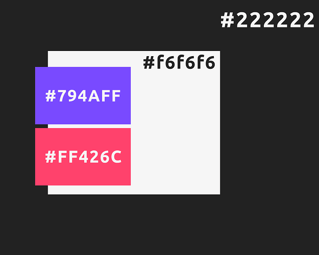
For people like me who wanted to visualize this:
I kind of already think that other’s proposals are probably better, but I still wanted to visualize my vision made with Reasonable Colors
EDIT: Fixed mislabeled pink color
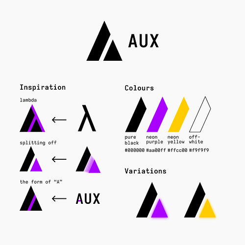
I do still really like this design. After thinking about it and the “auxolotl” concept I think this is where my head is at:
- This design is very close to Atlassian’s logo: https://www.atlassian.com/
- This design feels much more formal and corporate (not necessarily a bad thing, it’s well-refined)
- The Auxolotl feels more playful and fun
- Some whimsy can be a positive thing to put people in the right headspace to collaborate happily
Me and @minion were trying to figure out yesterday what it looks like. I’m glad you have finally put my head on straight and reminded me @jakehamilton. Lord knows how bad the itch in my brain was.
Fair, I was more hoping the “neo-brutalist” look would give a DIY independent type of vibe. ![]()
This is a very pleasant pallette. (although I think the secondary pink color is mislabeled on your visualization)
We’d only have to keep in mind that when putting text over the primary and secondary colors it needs to be large/bolded in order to conform to WCAG at level AAA.
I do like these colors, they stand out but aren’t too harsh. I am always a sucker for a good purple…


