I agree something whimsy is nice, at the same time I feel like simplicity and flexibility in a logo is important. What do I mean by that? At least within the nix world, there are many projects using different spins on the logo that are possible due to its simple geometric nature. It is visually distinct enough that even with color changes, rotation, and scale it is still recognizable in all environments. I feel like a good compromise is using an axolotol as a mascot, and have a more simple logo. (also pet peeve of mine, plz no logo with a background ![]() )[also the cuter the axolotol the better].
)[also the cuter the axolotol the better].
3 Likes
Oh, thank you, fixed that!
Fair point, perhaps the primary logo for icons and such could be a more straightforward geometric shape based on the shape of aux cables or something, and then the auxolotl could be used as accessory/alternate branding for websites, community platforms, social media, and things along those lines.
3 Likes
Something friendly and spiffy in reflection of foundational goals? Like light shades of green and orange?
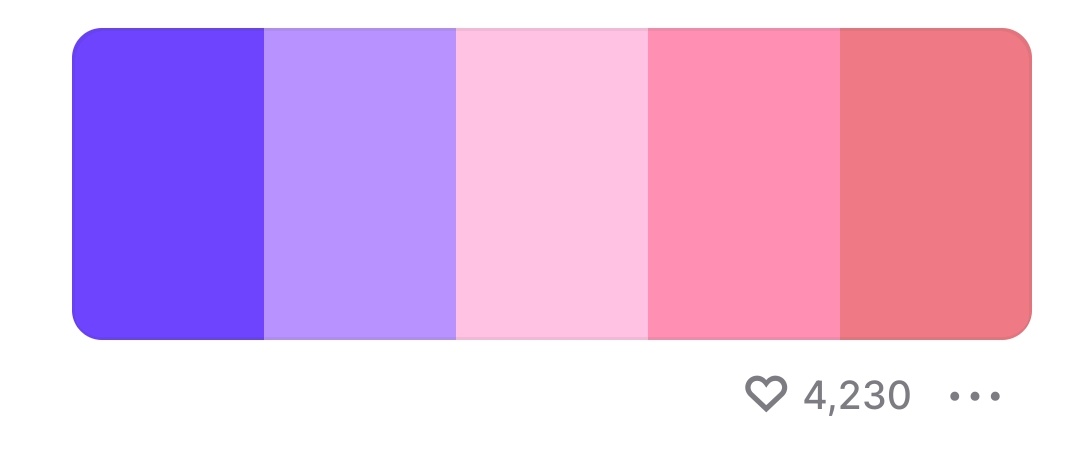
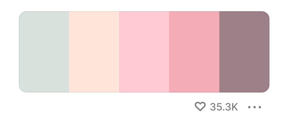
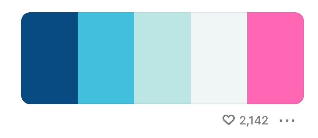
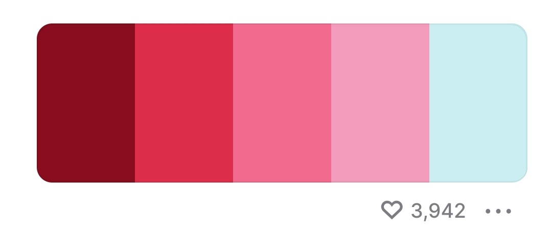
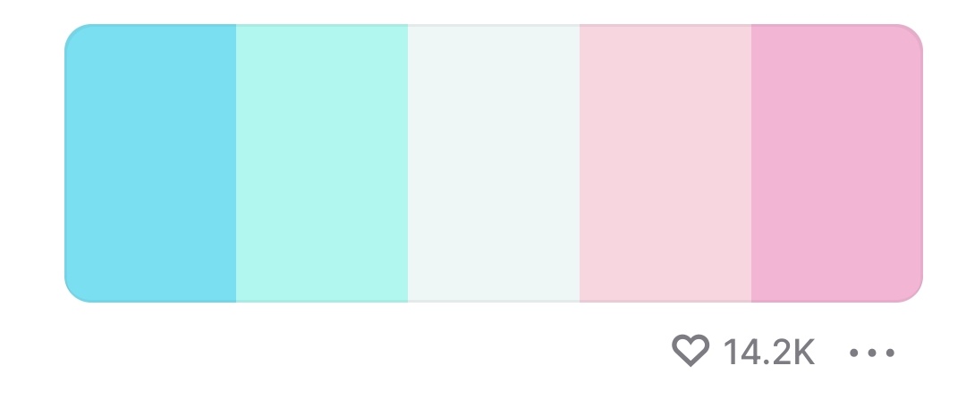
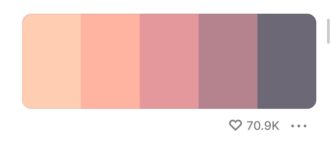
I’d probably be happy with any of these (no particular order). Not that I’m showing a ton of variety haha, but hey still. I would like to avoid cyberpunk colors in favor of something more inviting.


3 Likes
Would you be able to post links to these color schemes so we can more easily grab their color codes?
I think my favorite so far would be number 7 in the list here.
Actually it kinda already is, all of those were just screenshots from scrolling the trending section of that tool @blue posted
1 Like
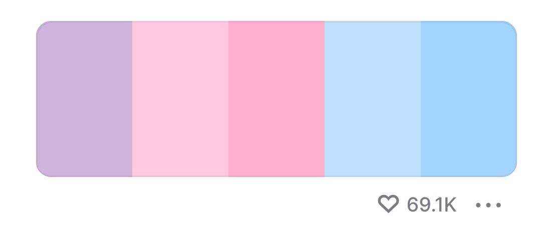
I really like your design, my only hesitation is with the color scheme. It matches almost perfectly with the non-binary pride flag, which in itself isn’t a problem, but considering what led up to this fork, is guaranteed to be seen as a statement.
I don’t think people need to be afraid of colors.
Also the Auxolotl is now officially nonbinary ![]()
12 Likes
omg yes ![]()
Re the colours, I’m not attached to the colours I chose but in general I don’t think we should be afraid of statements. Not sure what making a fork with non-binary colours would mean anyway haha
4 Likes
I guess I’m mostly just paranoid about trolls and culture warriors looking for any reason to attack the project, or to pull the narrative away from the great work everyone here is doing. I’m definitely not saying we should scrap the design because of that, it’s just something I could see happening
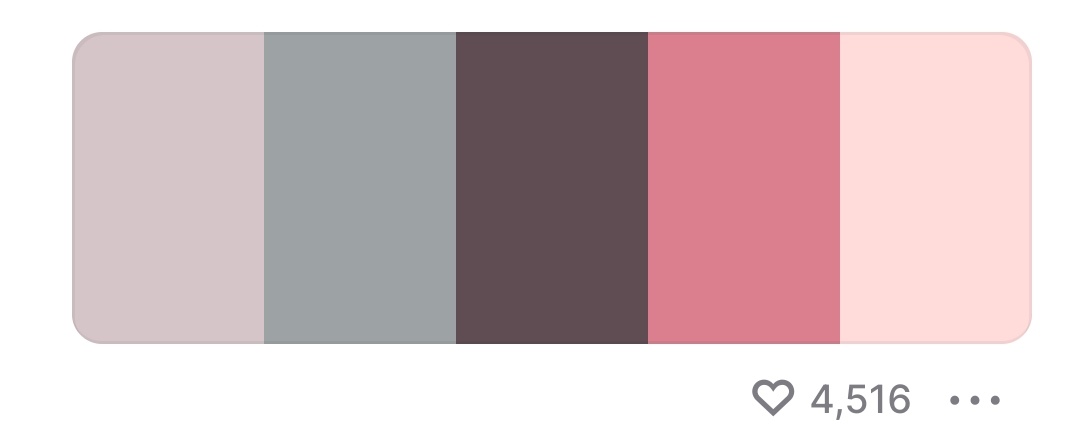
(disclaimer i am the creator of this colorscheme)
what about Misty (of Cuterose colorscheme?)

source of the colorscheme: https://codeberg.org/oomfie/cuterose
2 Likes
I’d love to see some experiments with it!
1 Like
its licensed under CC and there is a extended version and alternate mono version aswell
like Chilly

1 Like
I’m having a hard time picturing the same people not taking just about anything done by this project as more or less that same statement.
So what would be the point of restraint? ![]()
7 Likes
That’s a great point ![]()
First, thanks for giving the perspective. Always good to share concerns.
Second, I mean hey if it looks good then it looks good. I’m pretty sure one of the pallets I picked was the trans pallet.
Third, and at the risk of being controversial, I want to say that I don’t think community aspects should take a moral stance on something without votes. For example Auxolotl being non binary is not a moral stance. But showing support for Ukraine, even though its a 100% agreed they’re in the right, is a moral stance, and still deserves a check with the community even if the check would pass immediately.
Theres a weird line of “I’m just using Ukraine colors by coincidence”, and “we support Ukraine”. They could be pixel for pixel the same image.
1 Like
Violet and pink! Also, I think this is one of those things that should have a strict deadline to decide it, like a week and no more, end of discussion. We’ll run around in circles forever, and new people will have so many different tastes.
1 Like
I am going to build some versions of the site using some of the themes here to get opinions from people. I think seeing the colors in practice will make it easier to decide between them.
8 Likes
I wasn’t aware of this thread when I posted about Catppuccin color scheme in this post: https://forum.aux.computer/t/aux-beauty-campaign/134/186
4 Likes