If done well (aka not like my render below) A tail with an Aux connection might give the icon a bit of distinction from other axolotl icons on the internet.
Or even something more subtle, like giving it a tail that has the two stripes like an aux cable, or making it have a slight diamond shape at the end, rather than the tail itself being a literal aux cable.
softened the face shape up a bit, then realized it would look better if i softened the rest of the body up to match. what do you think?
(the reason i didn’t go all the way rounded is that some axolotls do have somewhat dome-shaped heads and making the head totally round would have fought with the rest of the body in terms of spacing + energy)
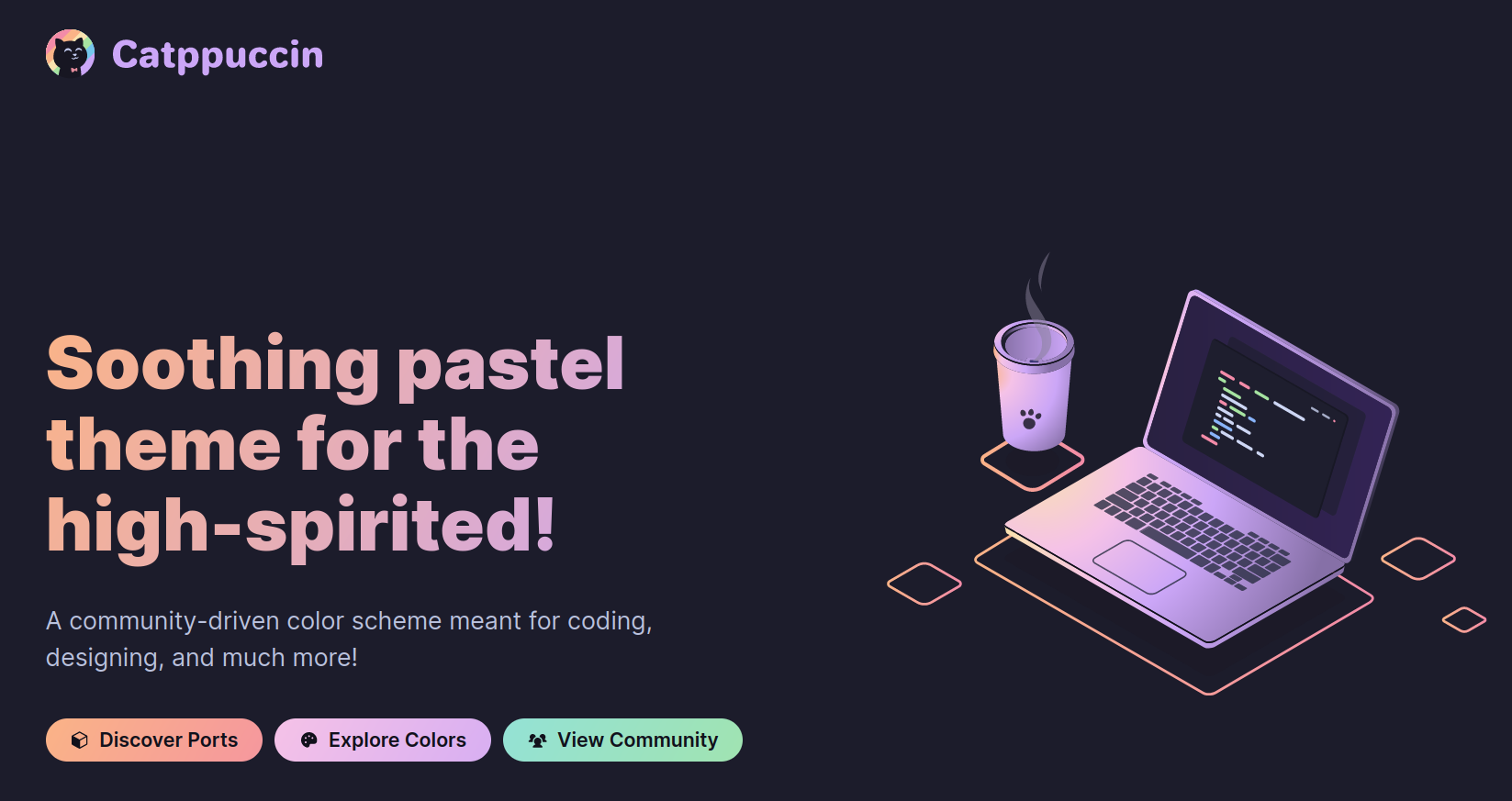
I bumped into this well-designed theming project, offering nice pastel themes not dissimilar to what OMG.lol have as their fun, lighthearted and gentle branding.
The project is esp. nice, since it is crowdsourced and rolling out these color themes over an ever increasing amount of existing tools. Ideal for the purposes of Aux, I thought.
I think we should tentatively commit to this logo, seeing as it won the informal vote for it, and most of the logo discussion since has been variations of it. It might help to see it in practice, and then we can of course iterate on it and try other stuff if people aren’t feeling it.
Would it maybe make it better if the tentaclethingies on the head were just a tad thinner? it feels like they’re a bit too fat for being rather thin (but hairy) on an actual animal.
This looks good. I also think that a colorized version of the logo is where those tendrils will really stand out since they are typically a different, more vibrant color than the body is.
Thank you for all your work thus far, you’ve done a great job. I’ll be experimenting with some color schemes on this logo when I get home from work later today.
Here are two colorized versions of @blue’s logo, one on a dark background, and the other on a light background with a heavy outline to help it stand out.


