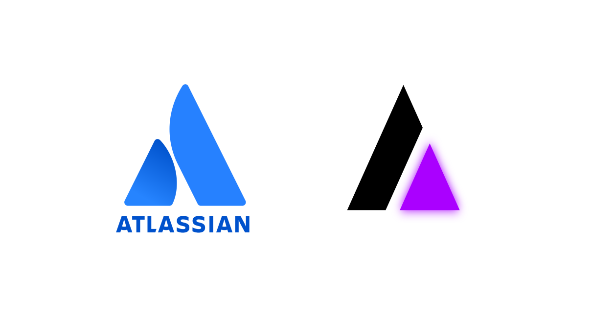
agreed, and this is an easily distinguishable logo from others as well. I can’t think of any software or service that has a similar logo.
1 Like
What do you think about trying this design using a white foreground with black background and another with the reverse? I have a feeling this design would fit perfectly in a lot of places.
2 Likes
i’ll make those and also send the original Inkscape SVG so you all can play around with it as well
3 Likes


I’m not a designer by any means, but I would say to maybe make the ends of the jacks more round and make the center body friendlier, like how it was in the purple and yellow? I really liked the informal vibe.
1 Like
This has my vote. Maybe even occasional accented versions depending on the surrounding design.
Phenomenal work here!
3 Likes
I think to complement this topic it may be a good idea to get a color palette going for continuity between all our sites/resources. Could you make a separate topic for that here @jakehamilton?
2 Likes
should i create a repo under auxolotl for branding stuff? i can’t figure out how to upload arbitrary files here.
Ha, read my mind!
By the way here’s the inkscape svg for my logo, if y’all are still interested.
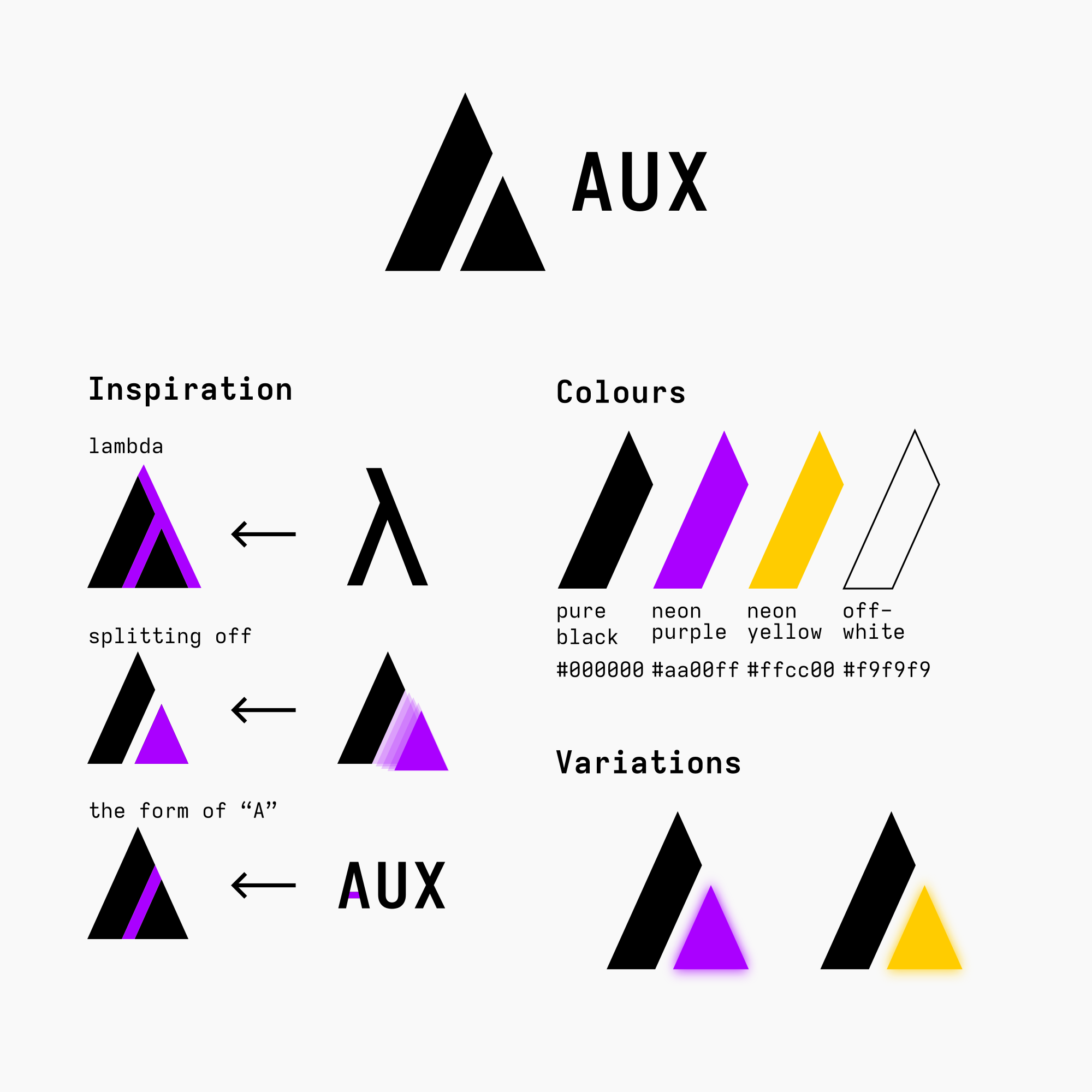
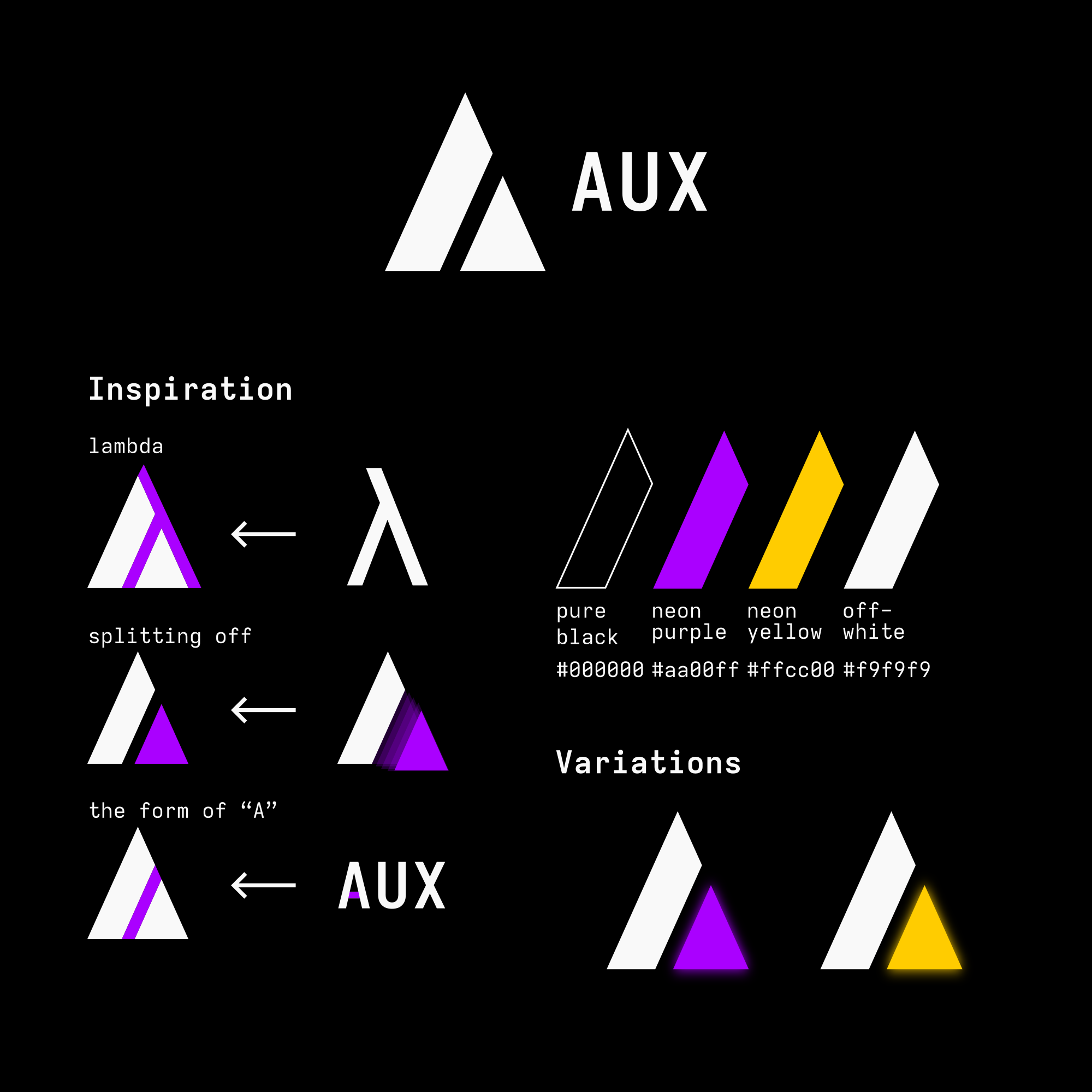
And dark mode, which is just the black and off-white swapped:
8 Likes
For the mascot, I think that, if the logo is abstract, then the mascot should be more cartoony. Examples:

(source)

(source)

(source)
The middle one is my favourite.
7 Likes
i’ll work on this some more once i get back to my computer.
1 Like
I wonder what mixing an axolotl and a lambda could look like
1 Like
To be very honest, I don’t like the boxy look, I think the axolotl should be round and friendly, and I also particularly don’t like the aux connectors. I think one pun is enough, and they also make the whole design look too busy and makes the texture feel off. I didn’t immediately realise what they were supposed to be and thought it was some kind of “tribal” tattoo type pattern, or that you were trying to imply detail or texture, but that wasn’t coherent with the rest of the axolotl’s face.
4 Likes
Maybe an axolotl hugging a lambda / “A”!
1 Like
I love those shapes and colors. I can’t decide if yellow or purple, both are equally cool but maybe yellow is more differentiated from other distros.
1 Like
Yes, Jake also pointed that out, but I think there’s enough differentiation:
In any case, it seems consensus is tending towards a more friendly logo.
3 Likes
I didn’t see his message in the other thread. I too am a sucker for purple.
3 Likes